In the modern age, data is everything. Thankfully, there are numerous tools available to help organizations analyze and interpret data, leading to improvements in decision-making, performance, and efficiency. Data visualization is the process of transforming data into a graphical representation, and it’s a great way to communicate complex information clearly and concisely. Keep reading to learn more about the benefits of data visualization.
Data visualization makes data analysis easier.
Data visualization helps your audience understand data more clearly, making it easy to explore and analyze information. Visualization can be used to communicate information about a dataset, identify patterns and trends, or highlight relationships between different datasets.
By representing your data in a visual format, you can see patterns that may be less visible when looking at the data in text form. You can also identify relationships between different pieces of data that would not be apparent otherwise. With accurate visualizations, you can quickly spot interesting trends and correlations in your data that could lead to new discoveries or innovations.
Data visualization is also an effective tool for communication. When presenting information visually, you can often communicate ideas more effectively than with text alone. This is especially true when there are complex concepts or large amounts of data involved. Visualizations allow people to quickly grasp the main points being made, which can lead to better decision-making overall.
The advantages of interactive data visualization.
Interactive data visualizations offer several advantages over traditional static visuals. Interactive formats can provide a more engaging experience for users, as they can explore the data on their own. This can help them understand the data better and see relationships that they may not have noticed before.
Additionally, interactive visualizations can allow users to customize their view of the data to suit their needs. This can be helpful for exploring specific data points or for comparing data across different dimensions. For example, when looking at a data visualization of the world population, the user might want to focus on the population of a specific country. By using the interactive features of the visualization, the user can filter the data to show only the population of the desired country.
What types of data are perfect for visualization?

Not all data is created equal, and some data is better suited to specific forms of visualization. Below, you’ll find some common types of data and the best ways to visually represent them:
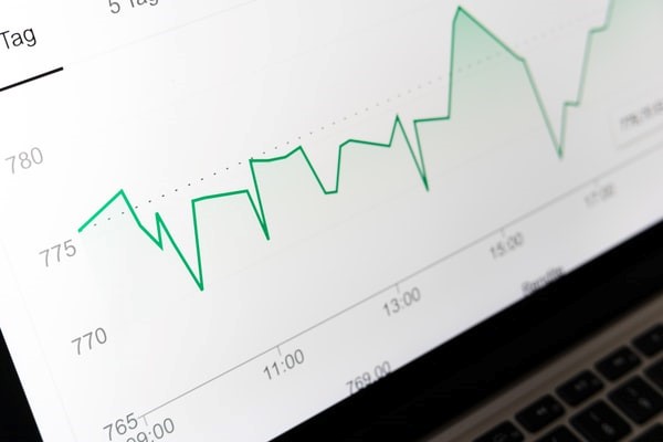
- Numerical data is easy to visualize when it is displayed as a graph or chart. Graphs are especially useful for comparing different sets of data, while charts can help you quickly understand trends.
- Geographical data can be displayed on maps so that users can easily see patterns and trends. For example, you could use geographic data to track sales figures by region or to study population growth in different areas.
- Time-based data can be visualized using timelines or animations. Timelines allow you to compare events over different periods of time while animations can help you see how something changes over time.
- Textual data is best visualized as either tables or graphs. Tables make it easy to compare different pieces of information while graphs can show how two factors are related.
- Categorical data is easiest to visualize when it is organized into categories. Charts and graphs are the most common ways to display categorical data, and they can help you see how one factor affects another.
Overall, data visualization is an important tool for identifying patterns and relationships that would be difficult to discern from raw data alone. By visualizing data, we can gain insights that can help us make better decisions and improve our understanding of the world around us.